Saturday, December 12, 2015

"Oculus Rosa"

Wow! It's been a ridiculously long while since I posted anything. In fact the last time I did a blog post was when I moved from Massachusetts to KY back in 2013. I've spent the last two years doing freelance illustration, a little video game concept work and painting commissions. I've been reacquainting myself with surroundings and my family and friends. 

A couple of months ago I was somewhat depressed about the way my career has been going. I've moved back to KY, now, for the third time in my life. I always find it difficult to make my career work here. Usually I end up finding a job and having to move to where that job is.  I was contemplating my options when I saw a Facebook post from a tattoo shop here in the town I live in. The owner posted that they were looking to add an artist to their shop and were willing to train. I responded with an introduction and link to my website. After a conversation or two we had a face to face and I'm now apprenticing to be a tattooist at Ink Well Tattoo in La Grange, KY under Scot Winskye. I've begun a new 10,000 hour journey. It's exciting, I'm having a great time and I have a lot to learn.
 
Photo by Anmarie, victim #1
Ink Well Tattoo, La Grange, KY
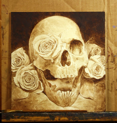
I decided to paint a small painting to bring in some Christmas cash and regarding subject matter I decided to stay within the tattoo mindset I'd been in. A simple skull and roses painting. As with some previous paintings I also used the limited "Zorn Palette" of lamp black, cadmium red, yellow ochre and white.

1.) First was the drawing in simple line form to be transferred to a piece of gessoed illustration board, 8 x 8.5. I added a small amount of texture to the board with acrylic gel medium.

2.) The drawing along with a thin wash to get rid of the white of the illustration board.

3.) For establishing the darks I broke from the limited palette and used burnt umber. It's what I'm accustomed to using and stuck with it.

4.) I blocked in a thin coat of the local colors.
 
5.) I painted the background, which was mostly black with a little color as it got closer to the roses. I then painted the four roses that were actually behind the skull.
 
 
6.) Next I painted the leaves and foreground.
 
7.) First I decided that the foreground seemed a little too cool and a little too clean so I hit it with some warm washes and a little spatter to dirty it up. Next I painted the skull itself. I made use of the texture that I put down on the board and kept my brushwork a little scrubby. The highlights were put on after the darks and mid tones dried.
 
 
8.) Finally there was only the last two roses that were in front of the skull. As it turns out I enjoy painting the roses red.

 
9.) The final high resolution scan. "Oculus Rosa" 2015, oil on illustration board, 8 x 8.5. The painting quickly found a home. Thank you Sarah.


Monday, December 16, 2013

Our recent move to Kentucky.

Some say "Home is where you hang your hat". I've done that for the majority of my life. I've always gone to where the work was. I've hung my hat on a lot of hooks. Others say "Home is where the heart is". My heart has always been in Kentucky. Every trip home left me more homesick than the last. The late Kentucky Governor, Albert "Happy" Chandler once said, "I Never Met A Kentuckian Who Wasn't Either Thinking About Going Home Or Actually Going Home".
 
Sandy and I have discussed moving back for years. I would work as a freelance artist and maybe start teaching workshops. We both lost loved ones over the past year and it made us realize that life is short and the future is now. After a bit of discussion we decided that if we don't do this now we might regret it later. The idea seemed right and crazy at the same time. We've done "crazy" before. There just seemed to be a certain comfort in this "crazy " though. When I lived in MA, I lived across the street from an old cemetery. I use to love going for walks there. Headstones usually say something about the dearly departed. Usually written by a surviving family member. "Beloved mother, father, son, Grandmother..." I never read one that said "He wasn't much of a family man but he had a good job and lived out of town most of his life".
 
Middle age often make people re-assess their lives and their priorities. So I asked myself what was important. Spending time with my family, being happy with who I am and what I do as well as simply trying to be a good person. The simple basics combined with comfortable and familiar surroundings. I've learned to never say "never".  But for now I can say I'm home once again and I am happy.


Sunday, September 8, 2013

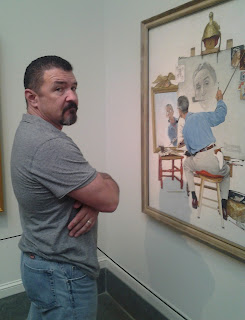
Trip to the Norman Rockwell Museum

I began painting at the age of nine. (Yep, that's me on the right.) At the time, I only knew of a hand full of contemporary illustrators. Norman Rockwell was perhaps the Illustrator I was most familiar with. Not only was I amazed by his talent, craftsmanship and storytelling ability but I could relate to much of his small town subject matter. For hours I used to pour over books with his artwork in it. I was around thirteen years old when I heard of his passing. I remembered thinking how sad the world would be with no new paintings from Norman Rockwell. As with a lot of my fellow illustrators the work of Norman Rockwell had a great impact on my work and from a very young age.
 
This Labor Day weekend I finally made my pilgrimage to the Norman Rockwell Museum. The Museum is nestled outside the small town of Stockbridge, MA in the picturesque Berkshires. While other small towns across the country have turned into strip malls of outlet stores, fast food shops and chain restaurant/bars, Stockbridge has retained it's small town New England integrity and charm.
 
I try to get out and visit art museums wherever I may roam. I've seen many originals from many from artists from throughout history. As I was driving to Stockbridge it occurred to me that I had never seen an original Rockwell painting. I was overwhelmed as soon as I walked in. I was familiar with nearly all of the paintings from the art books I had studied from my formative years. To see them up close and in person was a joy. However, I suddenly became "Sir" to the kind security folks at the Museum. "Sir please stay behind the ropes" Sir can you keep you hands away from the paintings". Had the ropes been electrified I'd have been slightly more consciences. But things being what they were,  I simply couldn't help myself.
 
Rockwell's, "The Four Freedom's" which were four paintings derived from the 1941 state of the Union Address by Franklin D. Roosevelt, were in a room all to themselves. The size of the paintings was imposing. I felt like I'd laid eyes on the Holy Grail complete with trumpets, angels singing and Terry Gilliam animation. It was an art religious experience.
 
Rockwell's Studio was relocated to the grounds behind the Museum in 1986. Originally the studio has been left the way it was when Rockwell died in 1978 at the age of 84. Later it was changed to a 1960s state. Seeing the workspace of other artists always intrigues me, as well. In Rockwell's Triple Self Portrait there is a helmet on top of his easel. That helmet is still on the easel. There is also a bent-up ash can next to the easel where he, no doubt, emptied his pipe. It too is still there. Last but not least was the that pipe. That crazy iconic pipe.
 
 
If you are ever in the Stockbridge, MA area, do yourself a favor and make the trip to the Norman Rockwell Museum. http://www.nrm.org/
 

Saturday, June 29, 2013

"Grouchy Bastard" a self portrait.

I have a very busy mind. I'm plagued with chronic, looping introspection. It makes it difficult to sleep at night and when I'm at the easel it's sometimes maddening. I think about things like growing older, mortality, regret, love, hate, loss.. avenging my enemies.. I wondered if painting a self portrait would convey any of that ridiculousness.

 
I painted this piece with the limited "Zorn Palette" of Ivory Black, Yellow Ochre, Cadmium Red Light and Permalba White. My hair is black and my facial hair is black and silver. I wore a black shirt and put up a gray sheet for my backdrop. This way everything would be very neutral colors except for the skin tones. I used a single light source. Kudos to my son Zach for taking the reference shots. Awesome job!
 
 
I tried to keep the composition simple. I wanted the positive and negative space to loosely balance out. I generally try to stay away from ever centering a person in a canvas. Off center is always more interesting. I backed the figure up and to the right. This way the person isn't looking directly outside of the painting but rather looking into the painting.

 
On a scrap piece of canvas stapled to a piece of plywood, I taped off a 9.5 x 12 area and transferred my drawing down and sealed it with fixative. I took the four colors on my palette and mixed them until I had a color that did not lean toward red or ochre and who's value was somewhere around a 50%. Just a nice neutral, nothing color to put down on the canvas as a simple wash.

 
If I wanted to be a true-ist regarding my color scheme I would have established my darks with black or a black/red/ochre mix. Out of habit I reached for the tube of burnt umber. I'd already laid down a few washes before I realized it. Oops! I think it'll be ok.

 
I didn't want to spent very much time on the background. I allowed paint to drip and threw some spatters in for good measure. As usual I work from background to foreground. I spent a little more time on the shirt than I did with the background. Not a lot more time, however. I wanted most of my detail and energy to go into painting the face. I tried to keep the edges relatively soft. and the further I got away from the face, the softer the edges became.


When I paint a face I generally start with the eyes. Once I've painted the eyes, I can see life in the face. It begins to be a person to me rather than pigment on canvas. The lenses of the glasses are, of course, clear. Earlier when I painted the background I painted the lens on the left because it was made up of the background colors. The lens on the right was comprised of the colors of the face. depending on how strong a persons glasses are there is a certain amount of distortion of what is behind the glasses. My glasses aren't overly strong so the distortion level was minimal. The edges of the lenses are probably the hardest edges in the painting.

 
The facial hair and the noggin hair were next. I threw down a mid tone, indicated the darks and then hit it with the lights. The very last thing I painted was the arm of the glasses. I do use a ruler for striking straight lines. A tricky little technique taught to me by my first year teacher at Central Academy of Commercial Art, Mike McGuire.
 
The signature is last and it's done!
 
 
Thanks to Mark Thompson for helping me with the video.
 
 
Cheers!


Tuesday, April 9, 2013

The Use of a Good Back Story.

Usually when beginning an illustration I'm provided with a manuscript, a key scene from a manuscript or in the case of trading cards a brief visual description of a scene or character. Since a picture is worth a thousand words, sometimes a brief description is not enough to go on. I can usually speak to an editor, art director or in some cases the author and ask questions to help me fill in the blanks. If none of these are available a fabricated back story can be a helpful tool. Actors use the technique of developing a back story to add depth to a character. When I ask someone to model for a painting I am essentially asking them to act a part.
 
 
The painting titled "Dolores" shown here was a painting and not an illustration so there was no narrative to follow. I knew that I wanted to do a portrait in the "Steampunk" genre so I spoke with quite a few people that were more familiar with the genre. Ultimately I spoke to one of my co-workers, Giuliana Funkhouser (affectionately known as G-Funk) and asked her to sit for the painting.


 Over lunch one afternoon I told her basically what I was looking for visually and she put together her character's back story. I asked her to talk a little about that process and Dolores' back story:


Fred said he would like to paint a figure sporting steampunk regalia in Zorn/Sargeant style but with a dark (& possibly brooding) feel to it. "Steampunk" can be anything you make it but I lean more towards the "punk" side of the look since my outfits are usually constructed for ease of dancing. With more elaborate projects I'll figure out what sort of fashion elements would best support a specific character idea and build an outfit from there. In this case to start I decided Dolores would be caught in conflict, wearing a fancy little hat, and packing a concealable weapon. My friends and I raided our closets for sassy and elaborate articles that would layer together nicely and provide maximum coverage appropriate to a proper assassin of the bygone days.
 
Photo by Amy Butts
"Dolores is a mercenary sharpshooter currently operating under the guise of a nanny for the elite Atlantean Nautical Quick Squad. As a girl she grew up in a town by the ocean, but as time passed the unchecked industrialization of the seacoast forced its denizens inland. Her husband - a tugboat sailor - has been estranged for many years, thought to be lost at sea. Dolores wished she could journey forth to find him but the best means to mobility was the join the army, where she scaled the ranks quickly on her wits and keen eyesight. With increased productivity and profits of the new era came the Great Air & Seas War, and Dolores had to be deployed on stealth missions behind enemy borders before her required enlistment time ran up.
Her latest job as a nanny to a high ranking commander's children has afforded her an interesting venue for society gossip, and from this position she's determined that her next target for assassination is her one and only lost husband. Naturally she is devastated at the situation but her training keeps her cool. What will happen next?"


On a couple of side notes,the rectangular framing element comprised of actual sprockets and watch pieces are painted over with gold leaf. Apart from the gold leaf, I used a limited palette of Ivory Black, Yellow Ochre, Cadmium Red Light and White. This is more commonly know as the Zorn palette, named for Swedish painter Anders Zorn (1860-1920). Zorn used this pallet of simplified primaries for his studio paintings. For outdoor paintings he was known to expand his choice of tube colors. Below is a self portrait by Zorn showing him actually using the palette.

Tuesday, March 26, 2013

Ode to a Friend's Passing

On March 8, 2013 my good friend of 23 year, Dennis Kauth, passed away. Aside from being a friend, father, husband, brother and son, he was an artist (though he did not look the part), an inventor, a former engineer, miniature model builder, avid outdoorsman, years ago rode with a motorcycle club, "blew things up" in the Navy... He lived a lot of lives. Back when I worked with him at TSR Inc. In Wisconsin, Dennis lived in a gray farmhouse. It was a cool place to hang out where everybody was welcome. Outside were horse shoe pits, axe throwing, potato cannons and a bone pit (I won't even go into that). In the basement was a homemade bar with a 75 gallon fish tank filled with Perch and Crappie. Every good bar needs a TV up in the corner of the room and a good sound system. There was all sorts of fishing gear and every power tool you could imagine. It was where he built things. Anything. We referred to his place as Dennisland. I always thought he should have had a big cartoon deer waving a welcome at the end of the driveway. It was also a place where you could be collaboratively creative.
 
Bottom row L to R: Dennis' wife Dorothy, me and D, and my wife Sandy.
 
Over the years I painted Dennis into a number of paintings (he was a really good character actor). He also built props for me to use in my reference photo shoots. On a couple of occasions I helped him out with a couple of his 3D projects (only in an assistant capacity). I've tried to gather up as many of those paintings here as well as a few candid pics. Some of these have stories. Some do not.
 
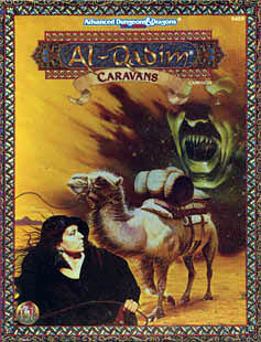
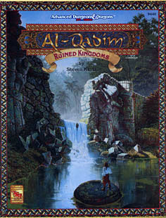
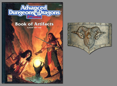
He was a demon face in a sandstorm. Years after the game module was published I noticed that it looked like he was about to bite that camel's ass. It makes me laugh even today.
 
A worn out old cowboy.
 
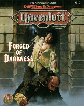
An unfortunate passerby who's about to get meat hooked.
 
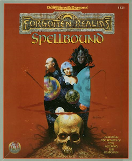
A wizard. The funny part was that just prior to me taking photos he went out on the balcony of my apartment, in costume, and yelled to the kids on the playground below "Where are my people? What have you done with my people?"Sandy looked at me laughing and said, WTF is he doing?"
 
We built a small maquet of this dam, the scattered bricks and shoreline.

 
Then set the whole thing down on a mirror and shot photos of it with an extreme wide angle lense.

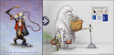
Dennis used to think he could make any story weirder if he could just add a ring Bologna, a monkey or a turkey baster. A few years ago I worked as a concept artist on a video game and threw a couple of ring bolognas in just for fun.
 
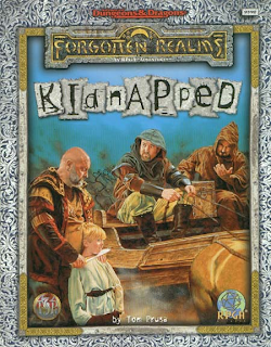
A creepy kidnapper.
Another wizard.
I must admit, I don't remember what this was done for.
 
At the bar in Dennis' basement we wrapped up my ex-wife up in 2 inch wide strips of cotton muslin and glopped on a bunch of clay slip.
 
Ahh the potato cannon. But it wasn't good enough when it was just white PVC pipe. It had to look like some sort of military weapon. It had a functional offset site. We talked about building a smaller one to mount onto my fishing canoe. I thought better of that idea.

I no longer have the photos of this head blaster. It was made out of PVC pipe and painted battleship gray because "it's a good sturdy color".
 
This one I managed to round up a photo of. Made from a 5 gallon bucket. The ram was sculpted out of 2 part green epoxy.
 
This book cover was originally on my schedule to paint. We started building the ship as a prop (I thought it was going to be a lot smaller than it was).  I spoke to the art director and suggested that we have the ship photographed and set against a star field. I think a real star field would have been better.
Below is a 54 second clip from a 1997 SciFi channel documentary about TSR Inc. I hope that the folks at the SciFi channel don't mind me sharing this short interview.
 
 
Somewhere Dennis is drinking mead and harassing the Valkyries in Valhalla.
 

Wednesday, August 29, 2012

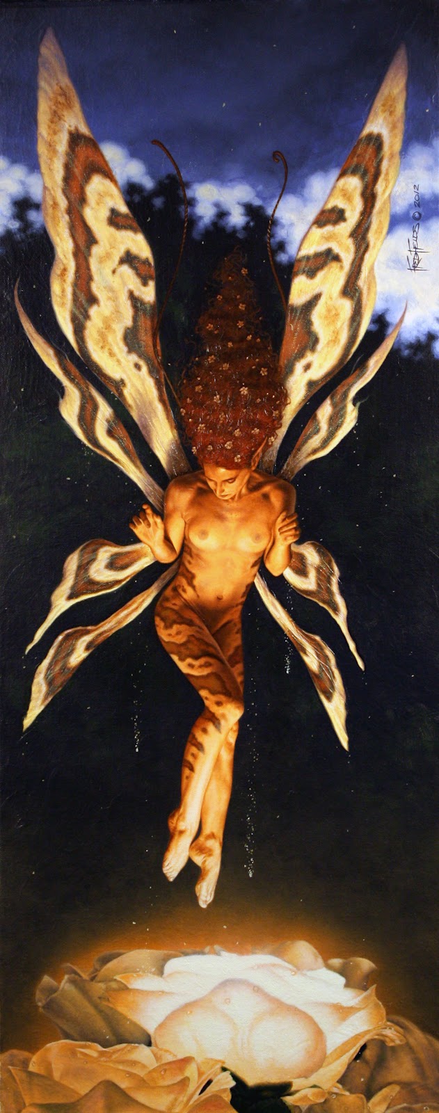
Dancing on Light

For me a painting usually begins with a doodle or an idea. I take photographs for reference only after the idea is fleshed out. For "Dancing on Light" that process was reversed. I had a supplemental shot of my model touching her toes to a studio light. Something about the shot struck me. She looked as though she was dancing. I could picture her as a faery lit from below. However the visual image of a moth flying around a porch light was blinding me from coming up with a more attractive concept. I awoke one morning with the idea that she'd be landing on a rose that was it's own light source. It didn't make any sense but then an 8 inch tall girl with wings and antenna didn't either. I went to the hobby shop and bought some silk roses then went next door to the hardware store and bought a battery, a flashlight bulb and wire. I set it all up in my studio and shot my reference photos. The last faery I painted had leg markings that looked a bit cat-like. I wanted to do something more reptilian. I ran across some great shots of Copperhead snakes on the Internet. I took the photo of my model into photoshop and on a multiply layer, I drew the patterns onto her legs and hips.
 
  
After burnishing my drawing onto a wood panel with canvas stretched over it I layed in my darks with a burnt umber and turpentine wash. I then blocked in a wash of color. The basic color scheme was, complimentary colors, ultramarine blue and cadmium orange. There are other colors but that was the main scheme. I treated the lit up rose like a candle or small fire at night. Warm foreground with a warm glow around the light source with a cool background. My thought with the background was that the sun had gone down, you could still see the clouds in the sky against the silhouetted tree line. I took a series of out of focus photos at dusk to make sure my colors were correct. 
 
 
After painting the background I painted the roses going from the farthest back to the closest to the viewer. After the roses dried I layed down a series of thin washes to create the glow. Next I painted the wings since they were behind the figure. After that it was a matter of painting the figure and deciding what overlapped what. I painted her left leg, her right, and torso. Then the forearms, hands, face and hair. The hair seemed to disappear into the darkness so I added the flowers to help define the shape of the hair. 
 
Fine'