Tuesday, August 31, 2010

The Illusion of Depth

Once There Were Buffalo (detail)

An illustrator asked me for a critique of his work a couple of weeks ago. One of the things I noticed was the lack of depth in his work. Depth is when you create the illusion that one object is further from your eye than another object or that two objects next to each other are actually much further apart. The appearance of depth is caused by the amount of atmosphere between two objects. Atmosphere, generally consists of moisture, dust and pollution. This causes darks to become lighter the farther they are from your eyes and lights to become darker the farther they become from your eyes. I paint from back to front. Meaning background, mid ground and then foreground. I mix my background colors more toward the color of the sky and the values more neutral. As an added measure I will wait until the background is dry and then take a medium value color from the sky background and go over the whole thing with a thin wash. Sometimes I'll interpret the background as having several layers and will put different layers of wash to create that effect. This will not work on a sunset since the color blue often gets filtered out as the sun goes down. The thicker the atmosphere is (i.e. dust, fog, humidity, rain, smoke, sea spray) the fuzzier the edges and detail of far off objects will be. This can easily be seen in maritime paintings. One of my favorite contemporary artist, Robert Bateman, is a master at creating mood with the use of depth. http://www.robertbateman.ca/art/arttitlepage.html

Lonely Are the Brave
I divided the background into four layers, the far off hills, the trees on the far side of the river, the opposite river bank and the ground that the pinto is standing on.


Cuttin' Through the Dust (detail)

This was one of the driest summers during my time in AZ. The dust (and manure) went air born like talcum powder.


"Teetering Peaks", Magic the Gathering card art

In this illustration I exaggerated the narrow depth of field because of the small reproduction size of the trading cards. The terrain reminded me of the Tonto National Forest, northwest of Phoenix. Very coyote and roadrunner.



Thursday, August 19, 2010

Color Studies

I don't do a lot of color studies. To me it's like painting a piece three or four times. In a case where I really don't know what I want to do with my subject matter I do a quick sketch, (in this case) make three copies, mount them on illo board, coat them with matte medium and paint different versions of the painting.

In this case all three are the same color harmonies. Red and it's complimentary on the color wheel, green. The first has most of the reds in the face while the background is green. The second is predominantly reds with green hints. The third is the classic dark background that the dutch masters made famous. They all work. The center is the one I chose to paint. Probably today I'd chose the dark background or some other kind of background altogether.Maybe a cracked adobe wall or something contemporary.

Navajo Elder

Saturday, August 14, 2010

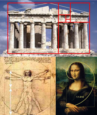
Using the Golden Rectangle

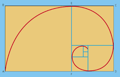
A golden rectangle is one where the length and the width are in the golden ratio or phi, approximately 1:1.62. It is thought to be a more aesthetically pleasing or ideal rectangle.


It occurs in nature in the form of leaf and seed patterns, sea shells, storm systems and galaxies. It even occurs in DNA.


The ancient Greeks knew of the rectangle. It was used extensively in the design of the Parthenon in Athens. At least since the Renaissance many artists and architects have proportioned their work to approximate the golden ratio.
There is extensive information online about the Golden ratio and the Fibonacci sequence that goes far beyond my interest or attention span. However if you are so inclined: http://en.wikipedia.org/wiki/Golden_ratio


My interest in the ratio is in it's aesthetically pleasing nature and how I can use it to assemble a better painting. Below are examples of paintings where I used the rectangle, as a compositional tools.
Nude With Butterflies
Jubilant
Red Shirt and Yellow Boy

Friday, August 6, 2010

Butterfly revisited.

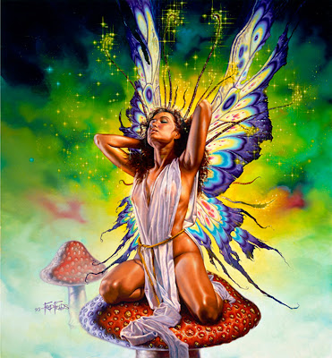
Back in 1993 I was given the task of painting the cover for TSR's "Women of Fantasy" Calendar. It was fairly successful cover and painting. I never know why one painting is more popular than the next. Whatever secret ingredient that was sprinkled into this particular painting is still a mystery. If I knew what it was, I'd dump it into every piece. Fifteen years after finishing the painting lamely titled "Butterfly Chick" I decided to paint another version. I painted very differently after fifteen years and thought it would be fun to see the differences.

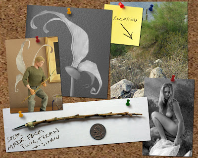
I decided that "Mourning Butterfly" would have the same wings and that would be about it. I thought she'd be a hunter or warrior. She carries a spear that has a small Agave rope attached, much like a whale harpoon. She'd carry the bare minimum and the cloth wrap needed to go away altogether. Everything in the desert has thorns fangs or stingers. She'd get that caught on something and get killed. I thought she could be visiting a makeshift memorial of some sort. Maybe a fallen comrade, family member or a mate. The roses were left here during a previous visit and are dried from the sun.
Here is some of the reference I used and made. It probably wasn't necessary to have made the wings, in hindsight. But I built them to scale for roughly a GI Joe/Barbie Doll. The spear was devoid of anything man made. My location shot, an alternative shot of the model and I could not find the any of the photos of the dried roses. She has tattoos. Maybe a henna-like stain but I used more of a desert sage color.

Thursday, August 5, 2010

JW's Birthday

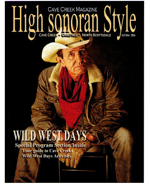
This painting was obviously used on the cover of an Arizona "cowboy chic" magazine called "High Sonoran Style". The title of the Painting is "Portrait of JW" and JW happens to be my Dad. I thought he'd make a pretty convincing cowboy. I think I was right. Happy birthday Dad.
The painting also appeared in "International Artist" magazine (below).


The Cave

"The Cave" refers to my studio. No matter where I've lived I've always had a room that was designated as the studio. It always seems a bit cavelike. It might be the lack of natural light. I tend to use controlled lighting. These are some photos taken of me in my cave. I think I was about ten years old in the photo on the far left, eighteen in the next, after that twenty four and it spins out of control from there. I just realized that all but one of the photos are flopped. I'm a card carrying lefty.